It began with what seemed like an endless pursuit of designing the right logo
It's been quite a while since I got to start with a clean slate; branding, conceptualizing, and visualizing something that the rest of the team was still trying to define through copy, programming, and logistics executions. It made me miss my old creative agency days.
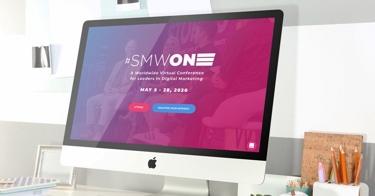
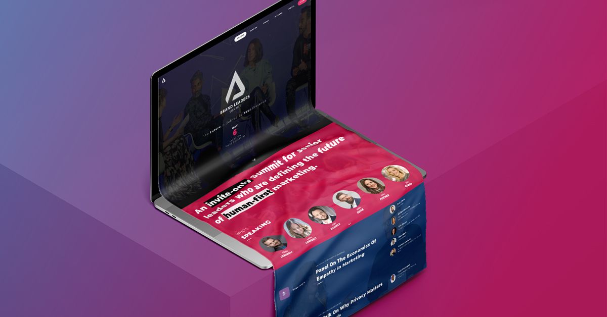
The Brand Leaders Summit is an exclusive and private event that will take place at the #SMWNYC conference in May, and potentially re-appear in our Los Angeles and London conferences later in the year. My challenge was to make it cool, unique, and coherent.
It's a B, it's an L, it's a Mountain, it's a Summit
After countless attempts, multiple strategies, I finally created one that the team and I selected. Simplicity is extremely difficult, you sort of have to begin with clutter in order to arrive at something that just about every non-designer individual asks for: "Clean, Elegant, Simple."
It seems familiar. I'm sure that's everyone's reaction. I assure you it's original, but perhaps similar in so many ways to shapes we've all have seen in the past.
The gradient is a tribute and a connector to the branding of SMW that I've launched 2 years ago as the Summit belongs to the family of SMW conferences, while demanding its own identity.
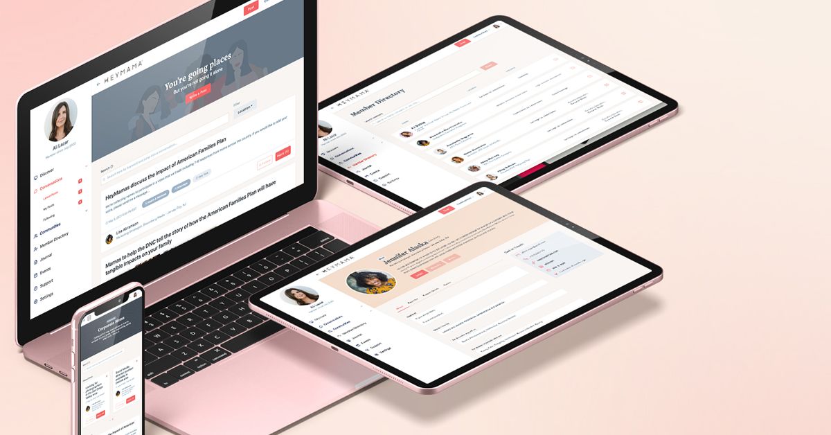
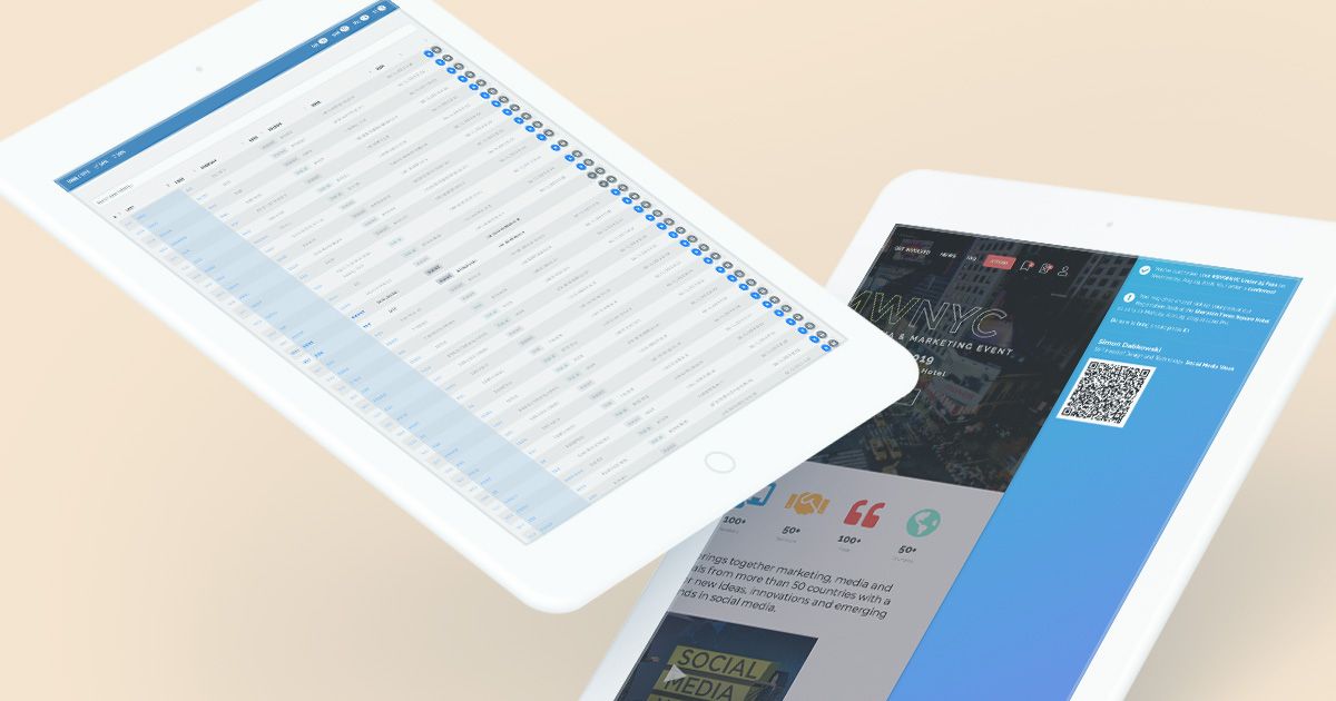
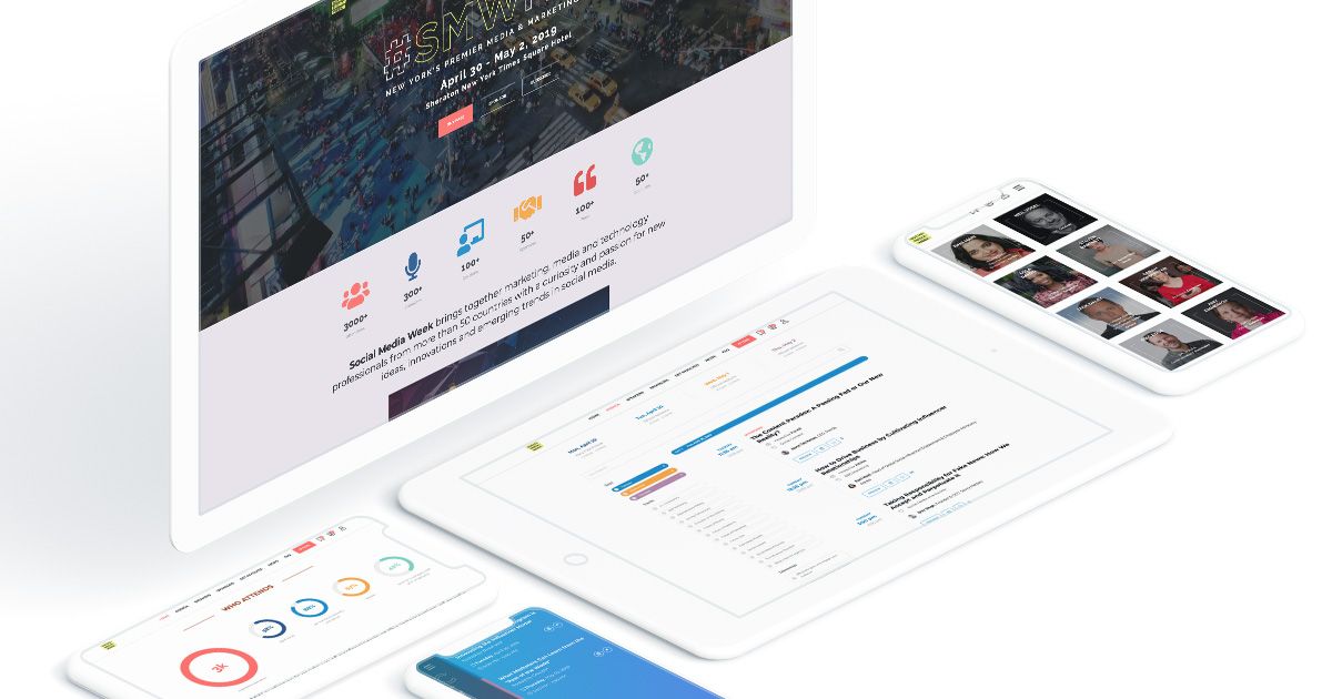
The Website
As great as it was to start a brand from scratch, creating an initial site for the Brand Leaders Summit was even more exciting because I got to completely unchain myself from the rest of the Social Media Week platform.
A one-pager was my ask. I immediately dismissed the idea of creating the same ol' dull vertical scroll that just about every other event out there is presented on. In fact, I immediately took inspiration from my own site.
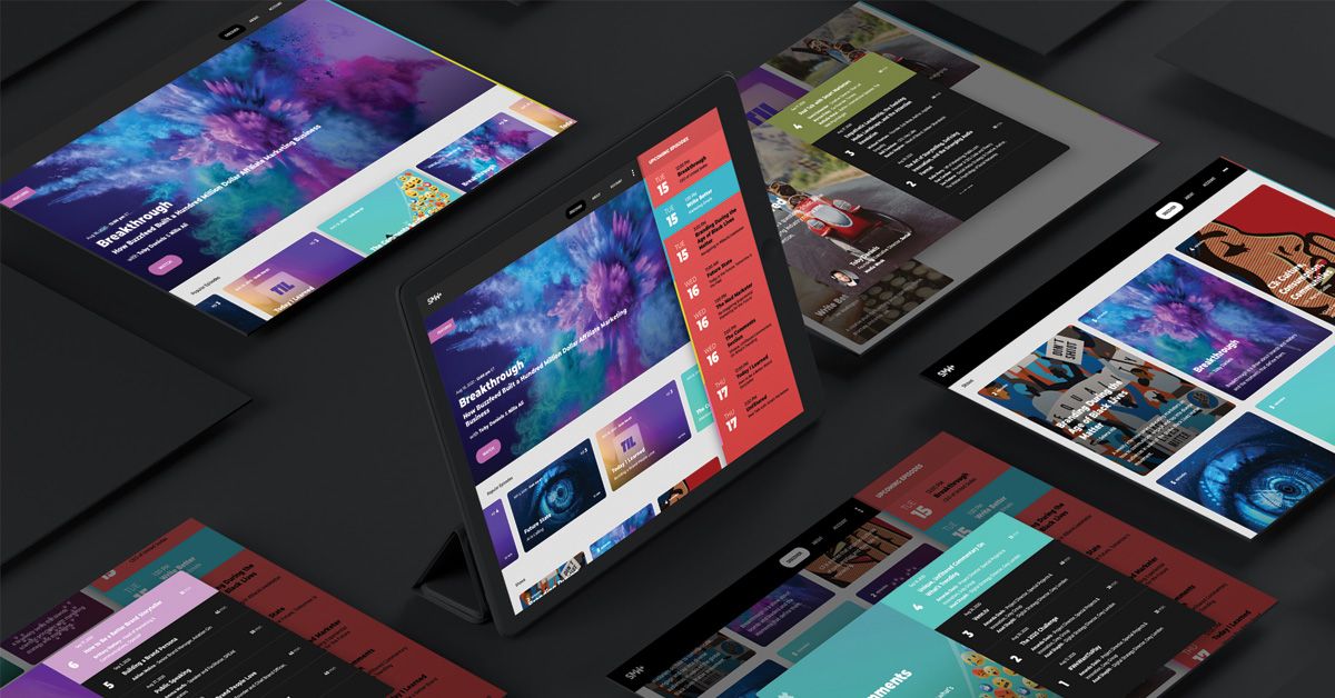
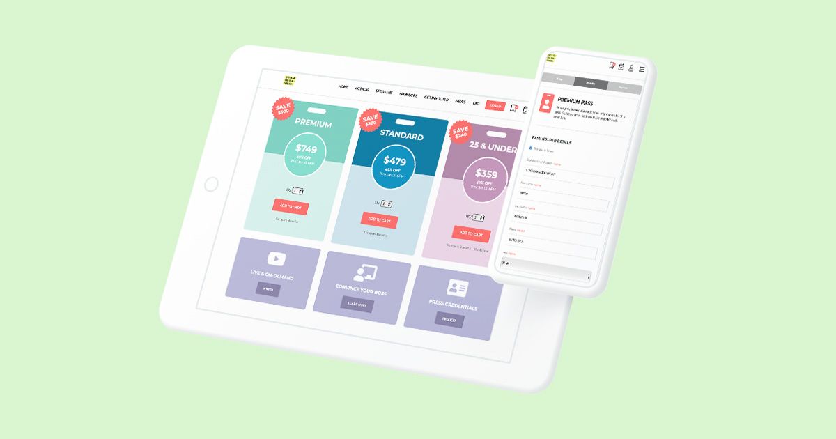
Sections that Snap, Copy that's huge!
Each section snaps. Some sections are short, some long, but once you scroll past the section you're currently on, you'll snap right into the next section. I felt the need for this type of pause; websites need to curate the experience for users. Animation of elements as you arrive on each section provides a bit of entertainment, as the content demands your attention.
Big in-your-face fonts. Say little, but scream it loud. I'm absolutely obsessed with Google's Monseratt font - especially because it comes in so many thicknesses - it creates endless possibilities.